- Blog
- DTC
min read
Peep Laja’s Top 5 CRO Tips For Better Commerce

When Peep Laja shares conversion rate optimization (CRO) tips, people listen. And for good reason.
The Austin-based CEO has made a career out of connecting companies like ConversionXL with customers and getting those customers to take the desired action.
Now leading Wynter, a message optimization tool for B2B companies, Laja continues to help businesses connect with customers. He’s worked with new, growing, and well-established ecommerce companies, including many on the Fortune 500 list.
And we couldn’t help but wonder what tips he’s been sharing lately when it comes to the world of ecommerce CRO. So, we decided to reach out to him and find out.
And to our delight, his answer had a lot to do with the “economies of better, not economies of scale” idea that we at Cogsy care a lot about.
Now, we’re sharing his conversion optimization tips with you, so your brand can leverage the insights and grow to be even more effective.
Laja’s first tip relates to product photography, which is the primary way products are sold online. And he breaks it down into three mini tactics: focus on quality, include rotating images, and add context.
As you dive into these tactics, be sure to A/B test your creatives with a CRO tool like Optimizely. That way, you know what boosts conversions and what doesn’t.
Right away, Laja emphasized that brands should think deeply about how they showcase what they sell online. It sounds obvious, but it can be tricky in practice.
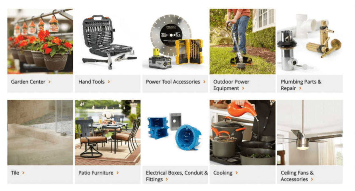
For example, Home Depot’s website design ranks high (97%) in UX scores. And it’s centered around using high-quality product photography to display its wares.
 Source:
CXL
Source:
CXL
But it’s not just the photo quality. One glance at Home Depot’s homepage, and you’ll see their photo selection is critical, too.
The images site visitors see run the entire gamut of their product lines. This includes renovated kitchens, fireplaces, bedding, power tools, throw rugs, storage, and more.
In other words, don’t take one nice photo and call it a day. Give each customer an experience. Show them what’s on offer, and think about your images like the online equivalent of walking through your store. Does the site visitor really know what you sell?
When you like something you see on an ecommerce site, what’s the first thing you do? You click on it. Meaning, you hover your cursor over it. Or, you tap it on your smartphone, looking for more information. And admit it: you’re a little disappointed when nothing happens.
We notice this effect with rotating images, too. Simply having a carousel of product images increases conversions up to 27%.
In fact, at Golf Galaxy, the company noticed that adding this carousel feature to their online marketing site improved conversion rates anywhere from 10-40%, depending on the product.
If you want to sell a couch, show it in context. Don’t photograph it in an empty warehouse. Include user-submitted photos of the sofa looking lived-in. Add details. Is there a blanket on it? A cat sleeping on its cushions?
This applies to other products as well. For instance, don’t restrict your jewelry photo to the pieces sitting on a solid-colored background. Show how they look on paying customers’ ears by repurposing social media posts in your marketing strategy.
It isn’t just about image quality which can be improved by image upscaling. It’s about what you choose to show (and the data suggests that people care about the human context).
Consider Medalia art, which boosted their ecommerce conversions by 95% by including photographs of the artists themselves.
Buyers need to know what (or whom) they’re investing in. They want to connect with it. And your pictures are their first window into that context.
A picture might say a thousand words, but as Laja puts it, you still need a copy to boost conversions.
That means understanding the psychology of a visitor who’s intrigued, but not quite yet ready to pull the trigger. The product copy lets you match your positioning to their needs.
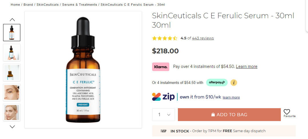
Your first goal should be to eliminate “logistics” as a possible objection. Let’s look at how Adore Beauty handles this.
 Source:
Adore Beauty
Source:
Adore Beauty
When you look at their product page, there’s a surprising amount of detail:
If you had any qualms about this product, the page answers them before even getting into the description. But what comes next?
When ecommerce brand Bob & Lush ran a survey, they found that customers were highly concerned about when the order might ship. This presented an opportunity to promote urgency. And, as a result, to spur sales based on shipping and delivery times.
By adding shipping details around “buy now to receive by X date” to a product page, Bob & Lush’s revenue increased by 27% among a 2,000 unique visitor test group. In other words, implementing urgency paid off (literally).
When you use a heatmap or run eye-tracking software like Sticky on your product page, you’ll likely find that most of the attention goes to your first sentence. That’s the one that’s most likely to convert website visitors. So, you should spend most of your time getting it right.
Think about it like writing a newspaper article. Your goal is to share the most relevant information right off the bat. This is your “lede.”
To do this, founder coach Dave Bailey recommends a simple trick. Can you summarize a product’s appeal in one sentence? If so, make that your first sentence.
Not sure how to measure the success of your variations? Consider split testing with a tool like AB Tasty.
If you’ve taken great pictures and written engaging web page copy, what else is there? Well, to put it frankly, getting out of your own way. This means reducing friction when a customer is in the checkout process, ready to buy.
Your first step here should be focusing on the user experience and reducing any pain points caused by excessive form fields. For example, this looks like fast page load times, intuitive functionality, and no unnecessary extra steps.
For example, with Google’s free API, you can have address information auto-populate. After all, the customer already knows their address. So, making them type it in only makes the buying process feel like a chore.
But form field friction isn’t just about simplicity. One study found that reducing form fields decreased the company’s number of conversions. And a CRO case study on Blivakker.no, an online store in Norway, found that it’s not necessary to eliminate all form fields.
Why? It’s better to eliminate the right fields. If you include unnecessary ones, you increase friction and consequently bounce rate. Likewise, if you remove fields customers expect to see, you might accidentally reduce trust.
A bit confusing? We get it.
Fortunately, there’s a way to balance the best of both worlds. New options like Fast.co are creating the “world’s fastest checkout.” The idea is to build trust with your buyers while eliminating as much friction as possible.
After all, Amazon’s one-click purchasing doesn’t set off any “trust” alarms. That’s because customers have experience with the company.
Likewise, if you can streamline your customer experience while establishing trust, you can boost your website’s conversion rate. And tools like VWO make implementing your checkout optimization strategies super simple.
Conversion rate optimization isn’t an end; it’s a means. And the goal is to leverage each dollar invested to maximize your returns.
The easiest way to boost average order values (AOV), according to Laja? Work with the customers who are already in your conversion funnel.
The only question is, how do you make upsells work?
It starts with relevancy. You have to offer complementary items to complete a product bundle. For example, one common CRO strategy is to sell a warranty “protection plan” along with a product. Not only is it another product you can sell, but it increases the customer’s lifetime value.
If you can add a “Pairs well with…” feature on your product page, you’ve already cracked it. But make sure to follow a simple rule of thumb. Each product recommended should cost roughly 60% of the items in their shopping cart.
And don’t forget what happens after the purchase goes through. The thank-you page is an opportunity to fill in information beyond the boring order confirmation.
You can also:
The keyword here is “honest.” If you don’t use legitimate reviews from paying customers, it will be hard to regain the lost trust it generates.
 Source:
Bully Max
Source:
Bully Max
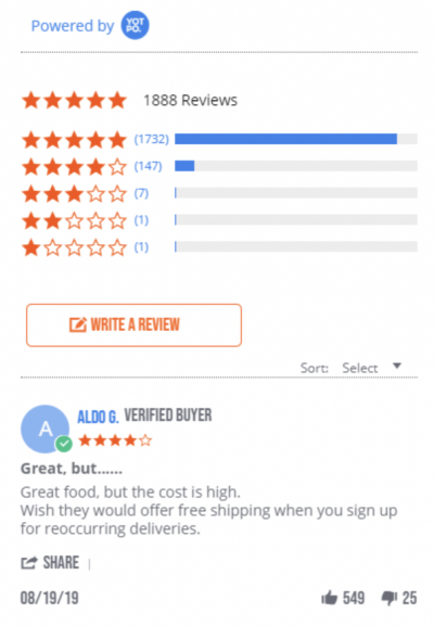
Take this example from Bully Max high-calorie dog food. The top review complains about the cost. That might seem like a problem, but consider everything else going on in the way of social proof:
Without saying a word, Bully Max builds authority, trust, and social proof into the landing page.
The lesson here is this: don’t delete negative or mediocre reviews. A product without a single blemish on its record sets off “too good to be true” alarms.
That’s because your target audience is smart. They know that even a great product won’t create a great experience for everyone 100% of the time. And because they know that, they expect to see that reflected in the reviews. And it’s better to offer up the information on your digital marketing site to maintain control over the situation.
After all, potential customers are going to seek out reviews anyway. Yelp, for example, reports that over 80% of its traffic comes when customers are already looking to buy a product or service online. And social proof on Yelp didn’t hurt, either: each star created an additional 5-9% in revenues.
Simply put, that means you need positive reviews. But you also need honest reviews. And you should put them right on your product page so people can do their research as they’re buying.
Peep Laja’s CRO insights are super valuable because they come from a lifetime of experience and hands-on experimentation with real brands selling real products.
But as Laja notes, higher conversion rates aren’t something that happens overnight. It takes ongoing work and experimentation to find out what works for your customers.
Nothing happens if you don’t get started with your optimization efforts. With these tips in hand, you’ll be ready to level up your CRO strategy and hit your wildest conversion goals.

![Your Guide To Improving Multi-Location Inventory Management [7 Strategies]](https://cogsy.com/wp-content/uploads/2023/06/Multi-location-inventory-management-scaled.jpg)